Big Bike Data; an Exploratory Analysis of Rental Bike Usage in the Chicago Area
Fast Facts:
- Dates covered: December 1, 2021 - Nov 30, 2022
- Rides recorded: 5,733,451
- Number of data features: 14
- Ratio of rides by members vs by casual users: 3:2
- Ratio of e-bike vs “classic” bike rentals: 1:1
- Average ride duration: 19 min, 25 seconds
- Total duration of all rides: 211 years, 304 days, 3 hrs, 43 min, 10 sec.
Executive Summary
The Charge
Given 12 months of user data, look for patterns and insights that might help to expand membership, stabilize revenues, and control operating costs.
Insights:
- There are some interesting geographical differences between members and casual riders. Many of the areas with relatively large proportions of casual riders are areas that feature higher proportions of non-white residents and lower household income levels.
- A relatively small number of the bike stations generate the majority of the “abandoned” e-bikes that need to be collected by company personnel.
- Some stations are “self-balancing” with roughly the same number of bikes departing and arriving each day. Other stations require active inventory balancing by company personnel.
Recommendations:
- Marketing that seeks to shift more casual riders to full membership should consider featuring imagery from the neighborhoods identified as having higher proportions of casual riders. That marketing could also valorize the fiscal wisdom of bike-commuting. Given the highly euro-centric image of cycling in the broader culture, capturing the look and feel of the Chicago that exists beyond the tourist brocures could also be an opportunity for the company to distinguish it self from its competitors. Incentives to ease the transition to membership from a cash-flow perspective might be considered as well.
- The company may want to compile a list of the stations that seem to generate the most work for company personnel in terms of recovering “abandoned” e-bikes and balancing daily patterns of inventory-drift. When financial headwinds begin to blow, these stations should be considered the first to go, with the inventory and equipment then moved to stations that “self-balance” in terms of inventory and that are less likely to generate “abandoned” e-bikes in need of attention by company personnel. This might allow the company to retain the majority of its revenue while shedding personnel costs.
Process Notes
The Data
The data utilized for this project was obtained from a bicycle rental company called Divvy that operates in the Chicago area. Their publically available data can be found on their website. With more than 5 million observations over the course of a full calendar year, this dataset is reasonably large and, despite the limited set of features, there are a number of business intelligence questions that can be asked with potentially actionable insights emerging as a result.
The data features contained here are somewhat basic:
- Start/End day & time for each trip
- Start/End station names and ID numbers
- Start/End latitude & longitude
- Rider type (Member vs Casual)
- Equipment used (classic bike vs e-bike)
Data Tools & Preparation
Analytical Tools/Packages:
- Pandas
- Numpy
- Matplotlib
- Seaborn
- Folium
Data Cleaning
- Data was exceptionally clean
- Missing values indicated e-bike rides that started or ended away from an established station
New features developed:
- ride duration
- ride day of the week
- ride month
- ride hour of the day
- distance from start to end point
Lines of Inquiry
How does bike usage among members differ from casual riders?
Riders who are subscribed members of the Divvy program account for around 60% of all rides, with their usage split fairly evenly between classic and electric bikes (Fig 1). Casual riders favor e-bikes a bit more strongly, accounting for approximately 3:5 of casual rides.
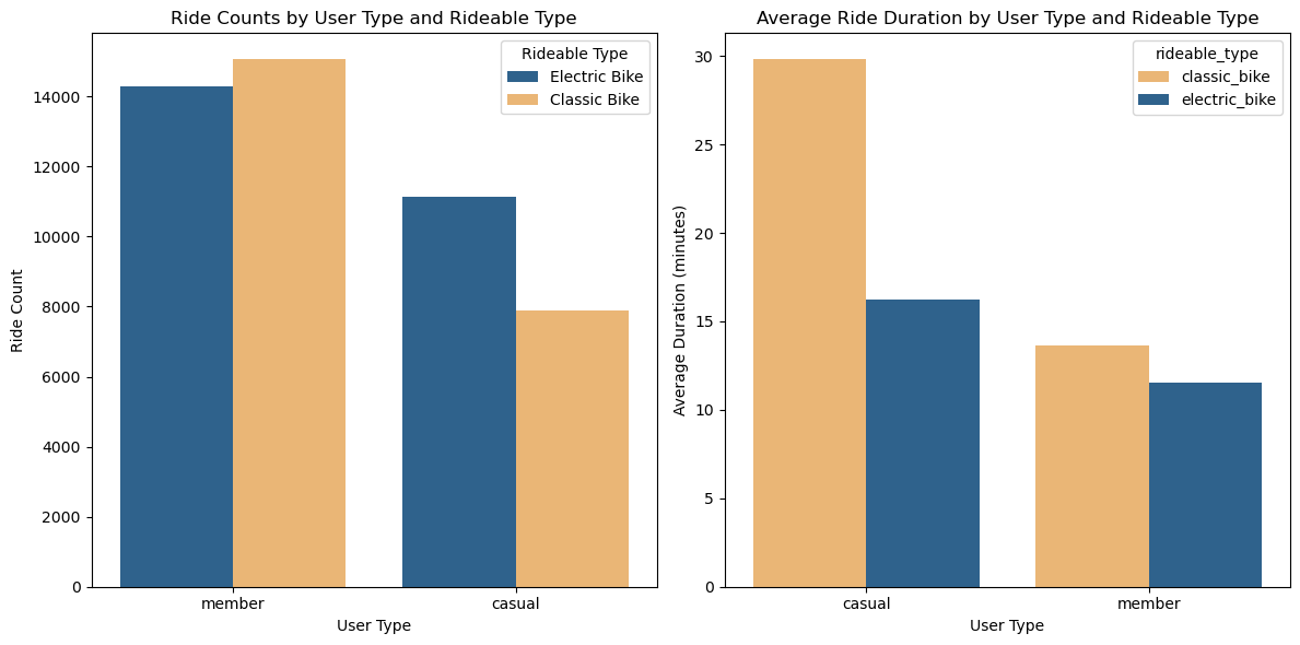
Figure 1: Ride counts & ride duration comparison?
Although casual riders seem to favor the e-bikes, they typically ride for longer no matter what equipment they are on, and this is particularly true with their use of clasic bikes with their average ride duration running more than twice as long.
Day by Day
The difference in duration would correlate with the notion that the member riders fit more of a bike-commuter profile, whereas the casual riders are more likely to be leisure riders or tourists. A quick look at the distribution of rides by day of the week for members vs casual riders (Fig 2) further supports this hypothesis.
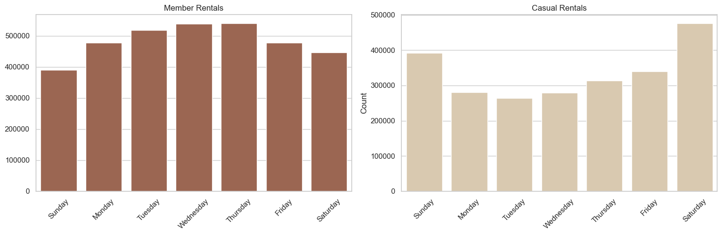
Figure 2: Distribution of rides by day of the week
The strong spike in casual usage on Saturdays and Sundays demonstrates this most strongly. The fact that the rentals among the members actually peaks on Wednesdays is interesting and somewhat unexpected. Something about “hump-day” apparently inspires the members to choose the bike-option?
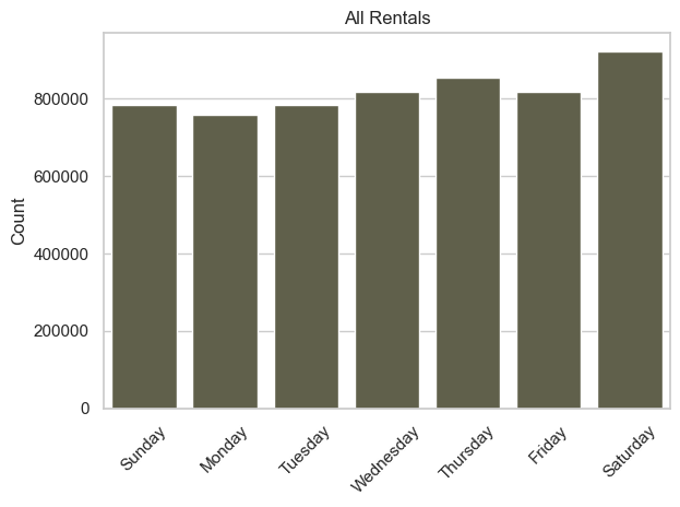
Figure 3: Combined distribution by day of the week
If you combine the data from the first two graphs (Fig 3), you can see that the usage begins to level out, which might indicate that the complementary nature of the member vs casual graphs is an idication that the system is operating near its maximum capacity. To wit, member usage is peaking on Wednesdays because casual usage is ebbing on that same day which makes more bikes available? Without a more complete dataset that includes the data from each individual piece of equipment, this is a difficult question to answer with any authority.
Month by Month
That said, if we examine the difference in ridership by month we can see something that would argue against that “maximum-capacity” hypothesis (Fig 4). In both cases bike rentals peak in the summer months, which is not surprising. Ridership should naturally drop off significantly in the winter; Chicago’s reputation as “The Windy City” likely makes bike-riding in January a fairly hard-core activity.
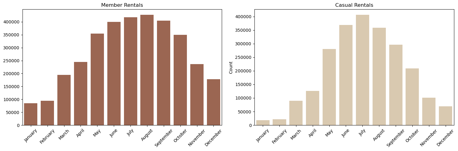
Figure 4: Distribution of rides by month
But the widths of these distributions are noticably different, with casual ridership concentrated much more strongly in the summer. This reinforces the image of casual riders as leisure/tourist oriented. Conversely, bike-commuters and others who use the service consistently, would be more likely to become members. And as communting has a daily-habit component to it, the persistence of ridership beyond the summer peak makes sense for the members.
The clear difference in usage throughout the year does undercut the earlier hypothesis that member usage may be peaking mid-week because the casual riders are making fewer bikes available for members to ride on the weekends. July would clearly be the month where this “competition” for rides would be the most accute, and if we examine daily ridership in that one month only (Fig 5), we can see that there are clearly plenty of bikes available throughout the week, with only Saturday standing out as a day where competing-for-capacity might be an issue.
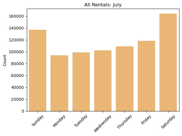
Figure 5: Distribution of rides by day in July only
If we flip dial the calendar back by six months and look only at the month of January (Fig 6), things look quite different. In general, there are not nearly as many folks out riding bikes (by a factor of nearly 10:1) but they seem to suffer the cold and the wind evenly regardless of the day of the week.
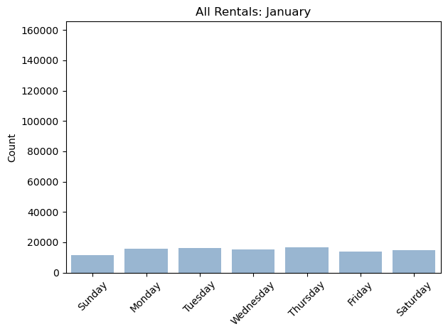
Figure 6: Distribution of rides by day in January only
One Final Theory…
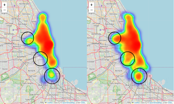
If the casual ridership correlates strongly with trourist/leisure activity, then ther should be a clear geographical difference in the ridership as compared to the commuter-oriented members. There is a discernable difference (Fig 7), but it has some surprises.

Figure 7: Heatmap of ridership activity between members (left) and casual riders (right)
One would expect that casual usage would be concentrated near the tourist center along the lake front, and there is a clear concentration of activity near the lake, but that concentration pattern aligns with similar areas of peak activity for the members as well. Surprisingly, the greatest distinction between these two groups is actually in the outlying regions. Casual ridership is significantly more pronounced to the south, southwest, and west of the loop as compared to the members. Perhaps the ‘Casual’ riders are not really the tourists after all!

Figure 8: Distribution of wealth by race in Chicago
As this map from Business Insider demonstrates (Fig 8), there are clear concentrations of low-income households to the west and to the south the central loop. Many of these same areas represnt locations of relatively high activity for casual riders as compared to members. Many thousands of rides are happening in these areas, and it would make sense that those riders with modest incomes might favor a pay-as-you-go approach rather than committing to the eternal fiscal tyranny of the subscription-model.
This has clear implications for how this company might choose to market itself to prospective customers:
- Although Divvy would be wise to market agressively to their casual riders during the summer months, in the hopes of increasing their population of the more predictable and bike-efficient members…
- Divvy should be careful not to design their marketing according to the assumption that their casual riders are primarily leisure-oriented.
- Divvy might be better served by developing marketing that valorizes commuting to work in the beautiful autumn months in marquee locations that happen to align with hotspots of casual activity in the outlying areas of these maps. Aggressive discounting & free months up-front might help make clients with slimmer bank accounts to make the transition. Other suggestions along this line of thought might include:
- Marketing showing Divvy as a convenient connection tool between home & mass transit.
- Marketing showing Divvy as a responsible & cost-saving choice as compared to owning a car.
- Making sure that marketing reflects the diversity of the client-base.
Minimizing Abandoned Bikes
E-Bikes are wonderful things and they represent a little over 50% of the rides in the study. E-bikes have the advantage of being electronically lockable, which means that they do not need to be secured into a docking station like the classic bikes do. A rider can simply hop off, log off and walk away. Similarly, they can be accessed from anywhere using the company’s app; customers can use the app to locate a nearby e-bike and to unlock it if they so choose.
But this means that e-bikes can, and do, wind up abandoned at random all over the place. Eventually those bikes need to be collected and charged, and the process of doing so represents a significant cost to the company. It would be nice to be able to minimize this cost…
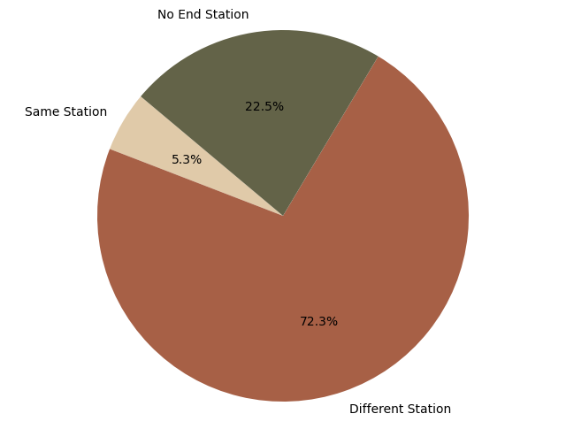
Figure 8: Where do the e-bikes wind up?
On average, a little less than a quarter of the e-bike rides that originate at a fixed station are “abandoned” out in the wild somewhere(Fig. 8). But there are some stations where this behavior is more pronounced.
If we calculate this “abandoned” statistic for each station, there is a massive difference between the 20% of the stations where the “abandoned statistic is the lowest, and the 20% where it is the highest (Fig 9)!
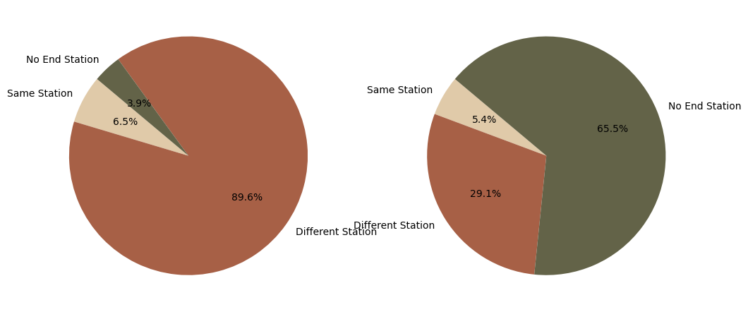
Figure 9: The 20% of stations with the least number of "abandoned" bikes vs. the 20% of stations with the most "abandoned" bikes.
Reducing the number of e-bikes available at the stations that seem to inspire the most “chaotic” behavior could save Divvy precious resources in terms of e-bike wrangling. As the following map demonstrates (Fig 10), there also seem to be areas where there are clusters of more “chaos” and less “chaos” prone stations.
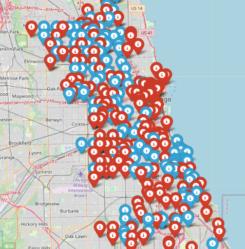
Figure 10: The 20% of stations (blue) with the least number of "abandoned" bikes vs. the 20% of stations (red) with the most "abandoned" bikes.
There seems to be a real opportunity here to optimize the placement of e-bikes so as to minimize the labor required to track down, relocate, and charge those e-bikes
Identifying High-Value Stations
At some point an organization is going to hit some difficulties. Recessions, supply-chain SNAFUs, and aging equipment can and will make things difficult at some point. Having some recommendations already in-place for effective ways to weather those periods of fiscal pain is a good idea.
With a company like DIVVY, the cost of the equipment involved is significant, but once in place, it becomes a sunk cost that cannot be reduced easily when a recession hits. Payroll, on the other hand, is much more fluid. If we assume that at some point DIVVY will hit a period of difficulty in which it needs to reduce its payroll expenses, then reducing the layout of the bike network may become a key strategy. Rounding up eBikes whereever they get left is time and labor intensive, and re-allocating the classic bikes from one station to another to account for the differences in morning vs afternoon commuting habits (Fig. 11) has a similar impact.
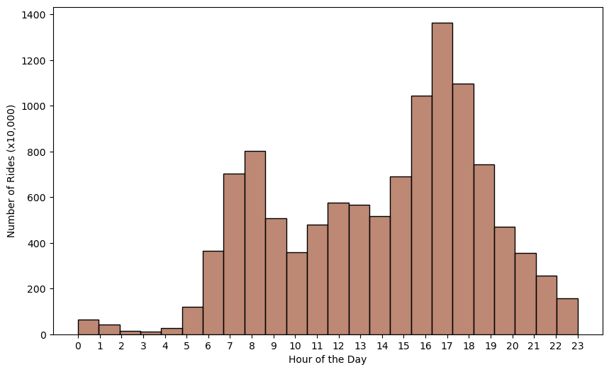
Figure 11: Usage of Classic Bikes by Members (Monday-Friday)
Some stations may naturally balance out in their daily usage, with similar numbers of riders beginning and ending their rides at those stations over the course of a day. Other stations may show significant discrepancies, which may require DIVVY to assign personnel and equipment to transport excess bikes to places where there are deficits. Here are some lists of the stations that encountered the greatest surpluses and deficits over the course of this study:
| Top 10 Stations with Surplus Classic Bikes | |
|---|---|
| Wabash Ave & Grand Ave | 520,000 |
| Columbus Dr & Randolph St | 430,000 |
| Southport Ave & Waveland Ave | 420,000 |
| LaSalle Dr & Huron St | 390,000 |
| Halsted St & Roscoe St | 360,000 |
| Indiana Ave & Roosevelt Rd | 360,000 |
| Millennium Park | 350,000 |
| Cityfront Plaza Dr & Pioneer Ct | 340,000 |
| DuSable Lake Shore Dr & Diversey Pkwy | 340,000 |
| Streeter Dr & Grand Ave | 330,000 |
| Top 10 Stations with Classic Bike Deficits | |
|---|---|
| DuSable Lake Shore Dr & Monroe St | -560,000 |
| Clinton St & Madison St | -490,000 |
| St. Clair St & Erie St | -480,000 |
| Michigan Ave & Oak St | -470,000 |
| Sedgwick St & Webster Ave | -470,000 |
| Wilton Ave & Belmont Ave | -390,000 |
| Milwaukee Ave & Grand Ave | -340,000 |
| Michigan Ave & Washington St | -330,000 |
| Halsted St & Wrightwood Ave | -310,000 |
| Campbell Ave & North Ave | -300,000 |
A geographical analysis of these stations (Fig 12) shows that while some of the bikes may only need to move a few blocks to get from a station with a surplus (blue) to a station with a defecit (red), other stations are farther afield. And all of this represents a significant investment in terms of payroll.
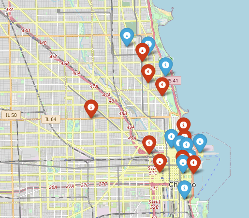
Figure 12: Locations of High-Discrepancy Stations
Should a period of financial difficulty arise, Divvy might consider closing these stations and potentially relocating the equipment involved to locations where the balance between incoming and outgoing bicycles is more natural.
Conclusion
This analysis is clearly just scratching the surface. Divvy’s private data warehouse likely contains data specific to each individual piece of equipment, as well as detailed usage data by client. Access to this kind of information would create rich opportunities for conducting equipment-efficiency and market segmentation analyses. It could undoubtedly keep a small team of data scientists busy full time. :)